Wednesday, October 5, 2016
Friday, April 8, 2016
Tuesday, April 5, 2016
Seven Deadly Sins
For my Seven Deadly Sins project, I wanted to do something that wasn't digital. I always wanted to try black and white line art and typography. I have illustrations, photography, and a lot of other type of work in my portfolio but not anything like this, so this was a good jumping point.
I wanted to keep the traditional sins, and although having only the words and letters themselves would have been good, (after all, it is a typography assignment so type should be first and foremost) I wanted to incorporate illustrations as well. I decided to combine animals (again) with type (flashback: animal illustrative type). This time, I wanted to keep the tone serious and intimidating, and black and white helped with that as well.
These are done on scratch boards with an X-acto knife. You just take the knife and scratch the surface with varying levels of pressure to create strokes. You work with highlights to create figures and shapes, rather than shadows and once a scratch is place, it cannot be undone. This was a different process for me, because I am used to being able to undo as often as needed digitally, but pretty soon, I wasn't concerned with it and started to enjoy it.
I have scanned these in and cleaned them up a little bit, getting rid of my pencil grid lines, etc., so that they look more polished.
For the packaging, I hand-sewed two sheets of scratch boards, lining them with black fabric in the inside for some premium feel. I chose red thread to stand out from the black and show the uneven, hand-crafted nature, but now I wonder what it'd looked like with black thread that disappears instead.
Here they are, enjoy!


Illustrative Alphabet
For my illustrative alphabet, I elected to draw and paint animals into letter forms. Rather than starting with a subject and then creating an ad based on it, I picked a audience and client first. What type of illustrative alphabet would a zoo use to attract more children and increase sales? Cute and playful animals that children would find endearing would certainly fit the bill! And that's where my process began.
Enjoy!

Tuesday, February 16, 2016
Block of Type
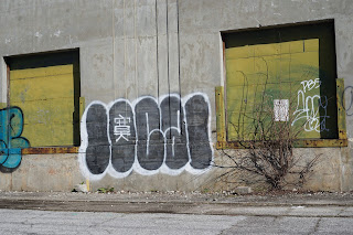
Who is this "Seapo"??? His tag is nearly everywhere in this block. I took these photos right outside my apartment. There is graffiti, mural art, trash and litter, and miscellaneous signs, all with interesting type. Take a gander and see all the various types and let me know if you can figure out who "Seapo" is!
Subscribe to:
Comments (Atom)


